Sample and effect sizes in hypothesis testing
One of the most troubling thing about p-values is the fact that if you gather more data the p-value naturally decreases. So, give me enough data and I will reject any null hypothesis, sort of. It makes sense that with more data I would be able to measure smaller effects. However, the whole effect size - data size coupling is what bothers me the most. Let’s make a quick experiment.
First of all, the libraries we’ll use have to be loaded.
# Libraries

library(dplyr)
library(purrr)
library(ggplot2)

theme_set(theme_minimal())
Let’s create a function that, given a sample size and effect size, returns the p-value of the t-test that compares two normal distributions with variance 1 and difference in means equal to the given effect size.
# Given sample size n and effect, compute the p-value of
# t-test generating the respective samples
t_test_value <- function(n, effect) {
  t.test(rnorm(n), rnorm(n, effect))$p.value
}

# Surprisingly logarithmic sequences don't exist in base R
lseq <- function(from, to, length.out) {
  # logarithmic spaced sequence
  # blatantly stolen from library("emdbook"), because need only this
  exp(seq(log(from), log(to), length.out = length.out))
}
We can run this function for different sample and effect sizes and see when we would reject assuming a type 1 error of 5%.
# Experiment

# Create pairs of samples sizes and effects
results_tbl <- expand.grid(
  as.integer(lseq(50, 1e5, 100)),
  5:100 * 0.001
)
names(results_tbl) <- c("n", "effect")

# We make use of the elegant purrr
# to apply the funciton in the grid
results_tbl$p_values <- map2_dbl(
  .x = results_tbl$n,
  .y = results_tbl$effect,
  t_test_value
  )

results_tbl$hypothesis <- if_else(
  results_tbl$p_values < 0.05,
  'rejects',
  'accepts'
  )
# Plot
ggplot(results_tbl, aes(x = n, y = effect, fill = hypothesis)) +
  geom_tile() +
  scale_x_log10()
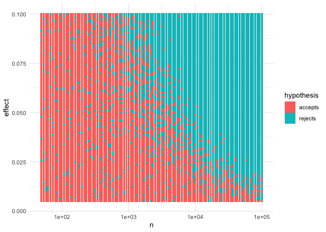
We can see that, given enough data, we reject for almost all the effect sizes. And conversely, given an effect size, it’s only a matter of getting enough data to reject the null hypothesis. I find this very troubling.
I even think one can analytically derive the equation of the curves in the effect and sample size space that have constant p-value, which should approximate the line that splits the red and blue dots in the picture, but I’ll leave that to the reader.